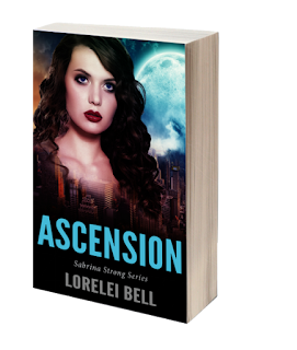
Now we get into the covers.
My publisher sent me some design ideas this morning, making the point that he could sell these sort of books with covers that have images of people on them much better than the "abstract" styles.
The old covers done by my ex-publisher were more abstract. My first two definitely were more abstract and had little to do with the content.

These were good, but let's face it, the abstract is a bit strange, and for some, it might not really get them curious enough to bite. In fact, it might have been a turn-off for some, and although men have read my books, the series is more aimed toward women.
I do believe the cover gets people's attention. While these were fine, in the beginning, I have to admit, I wanted something better. Something a bit more sexy, but not tending toward "paranormal romance", because that's not what I write. These are urban fantasies.
We want something looking more like, well...
This:
 |
| Cover Ideas for Sabrina Strong Series |
Of course these are merely ideas to bounce around between me and my new publisher. I didn't get that chance before--have input as to what goes on the cover.
So, we're at the stage where we are talking about what could sell the series, trying to find an image that we could use for the series.
The above covers, are not the ones chosen, of course. These are ideas to bounce around. I told Miika I liked the whole concept of Sabrina (who is brunette), should be on the cover, the moon and the city somewhere isn't a bad idea either. I threw in a few ideas for future book covers, as well.
So, this is where we're at on getting the book(s) out there.
I've a feeling I'll be doing a cover reveal soon. Stay tuned!


I never had any input on the books I published through Berkley. They were beautiful but for the most part said nothing about the book. Some of my fellow authors and I used to joke that if you lined them up, they looked like DeBeers ads.
ReplyDeleteSilhouette used to send me a form to complete for their art department for each book. Once, as a joke, when asked for a description of a baby in the story, I said, "A Cabbage Patch kid."
My editor said, "Nooo--that's what they'll give you!"
(The artist used her own baby as the model.)
Miika tells me Creativia can use Collin's cover designs for The Unicorn's Daughter and Chasing the Wind and will reserve judgment on the rest until he's seen them.
Oh, good. Those are good covers!
DeleteAnd I've heard that same thing in the trad publishing houses you don't really have control. Not at all.
Sounds good.
ReplyDeleteI'm excited to see the new covers!
ReplyDeleteIt sounds like things are going along nicely.
ReplyDelete~Shelly, yep
ReplyDelete~ Heather, I am too!
~ William ,So far, so good.
I can't wait to see what they do with this.